Mobile Access App
Images
Description
Description
Description
The Problem
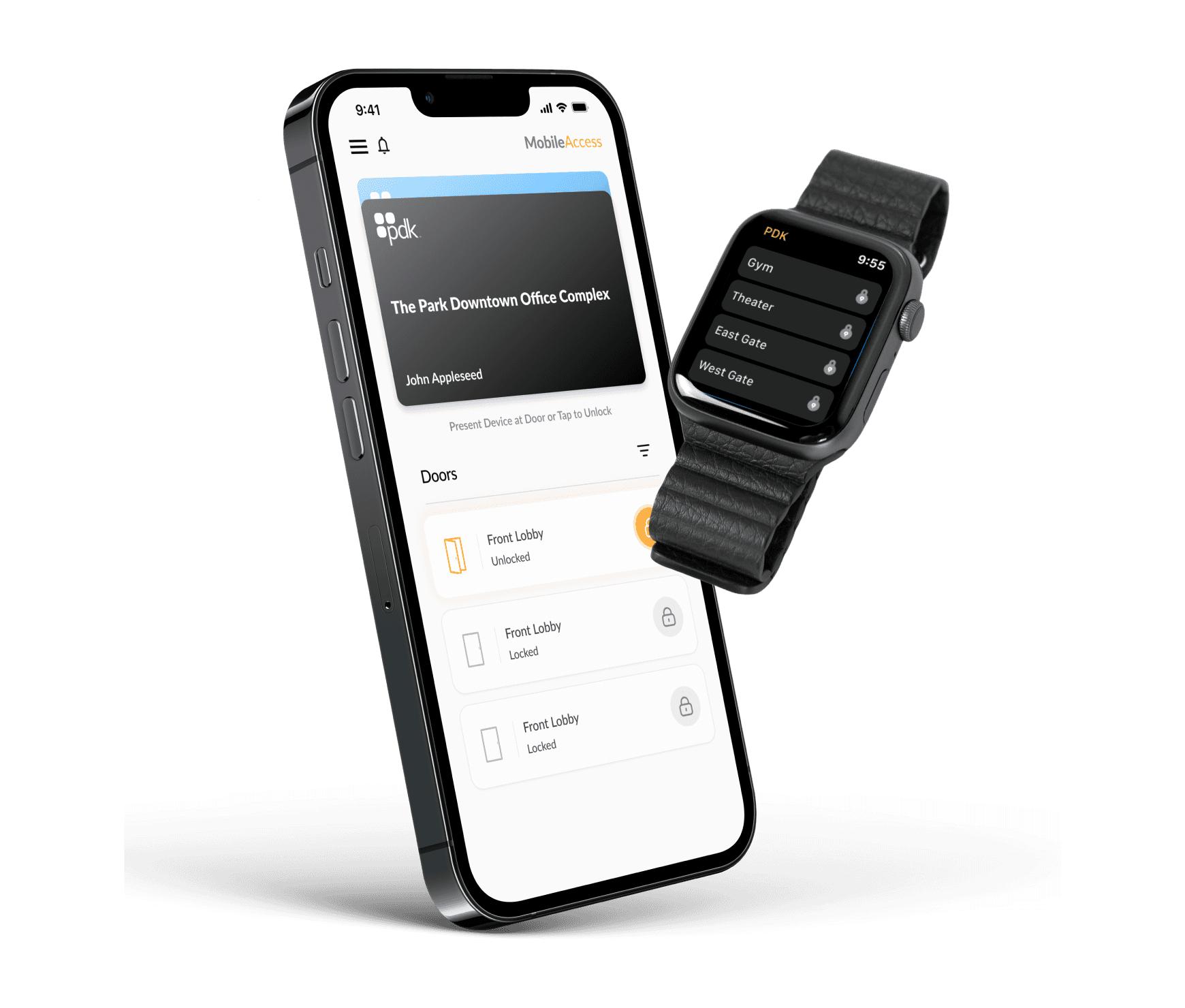
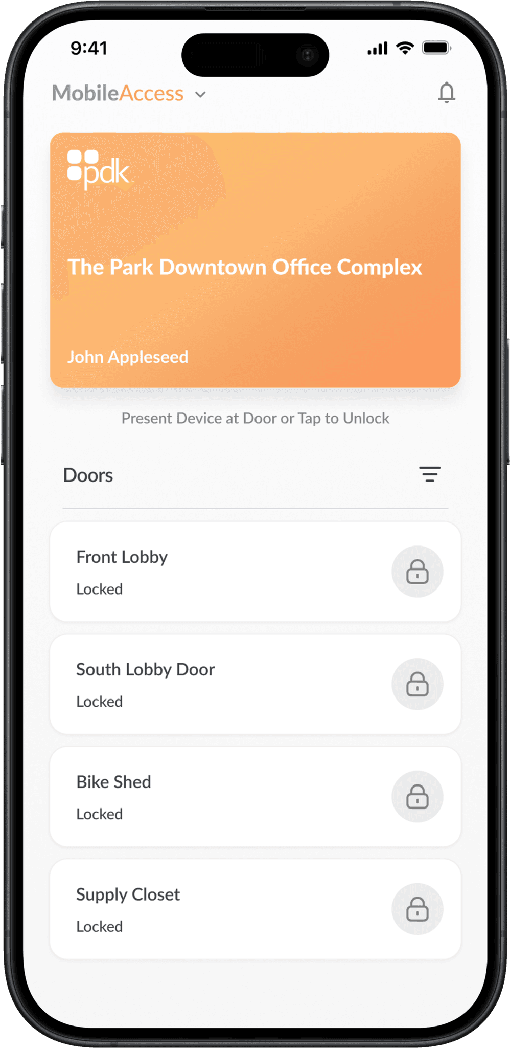
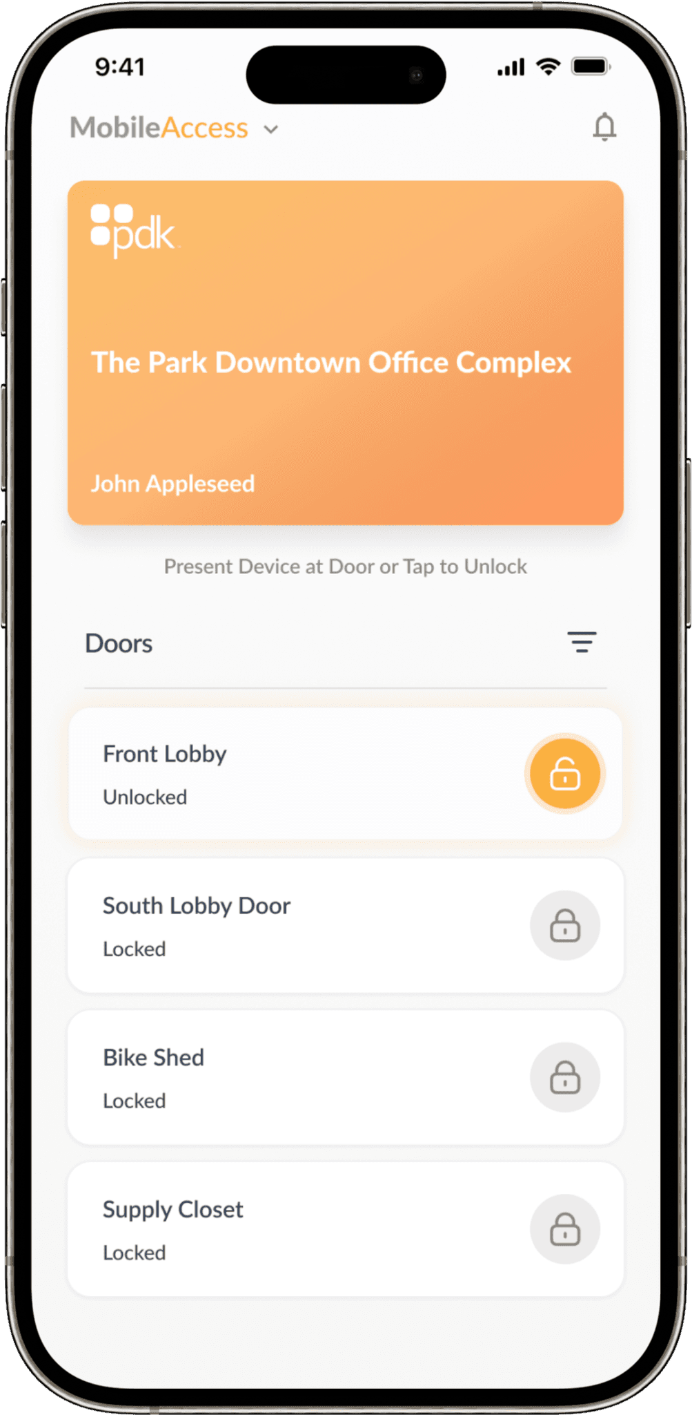
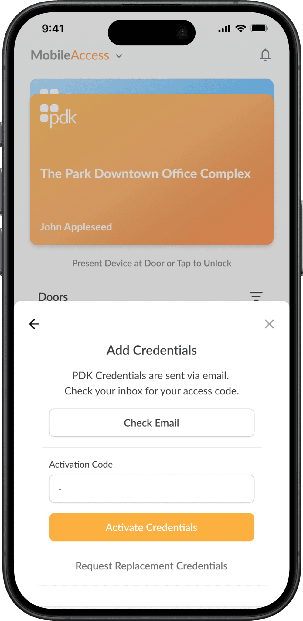
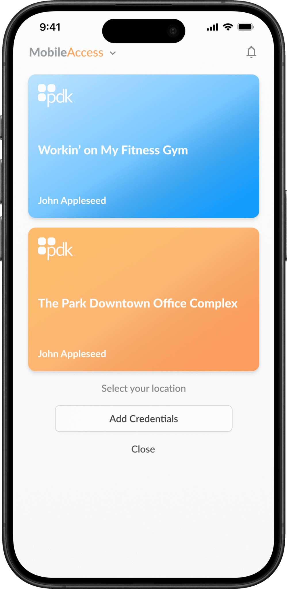
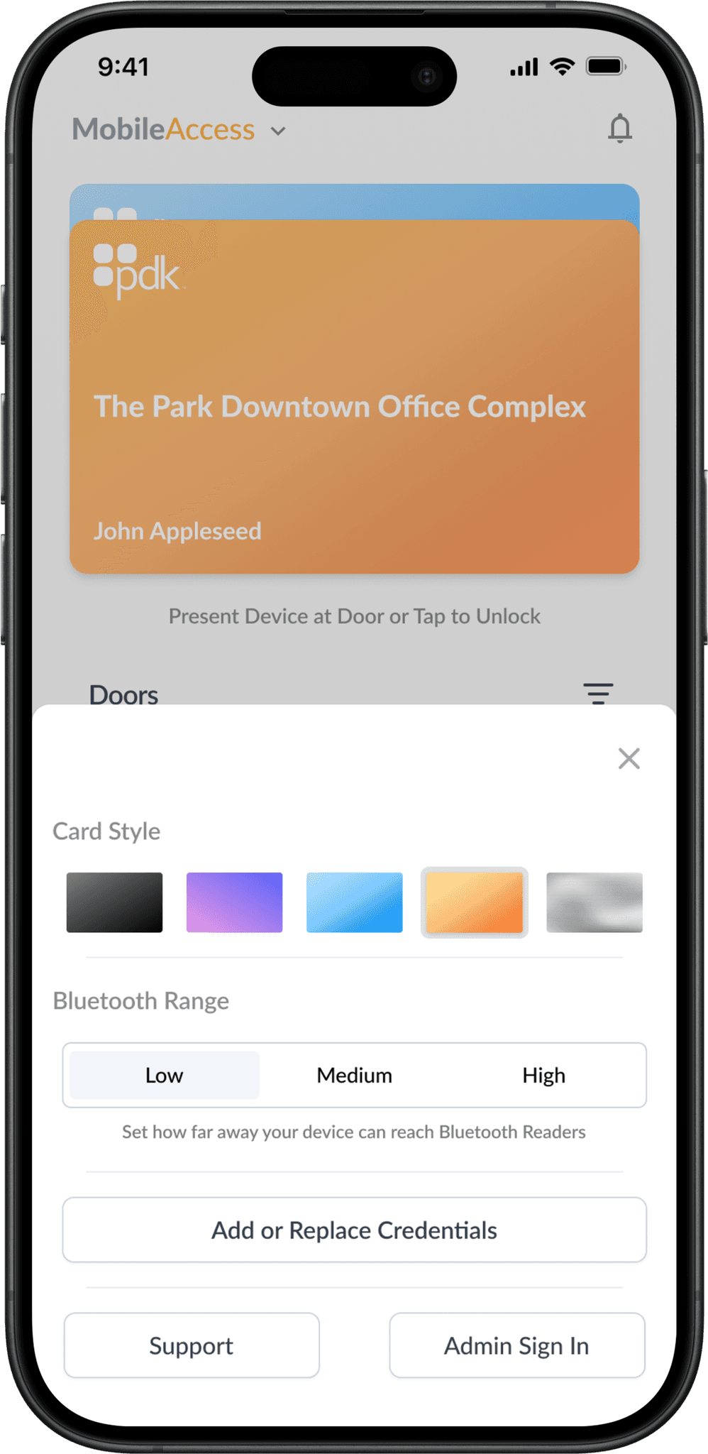
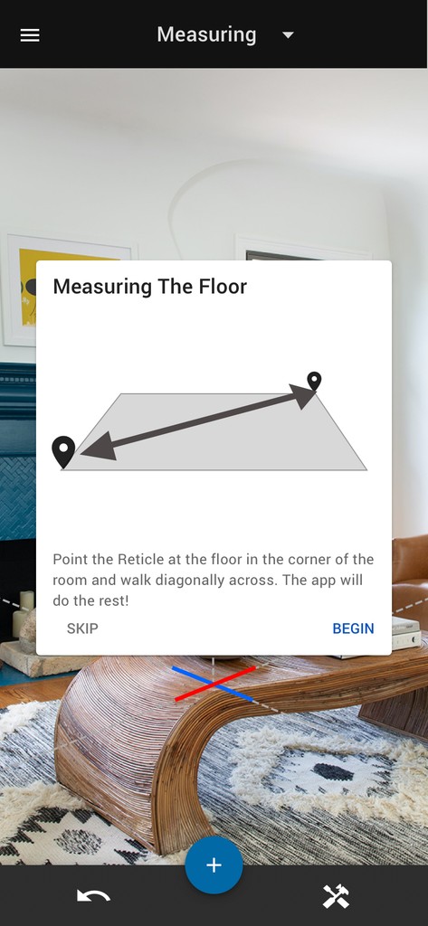
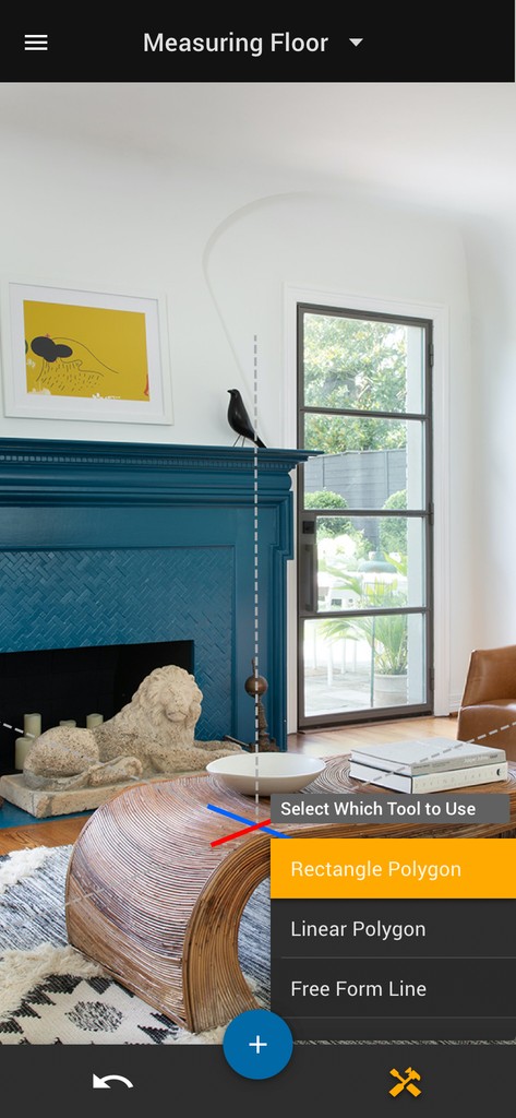
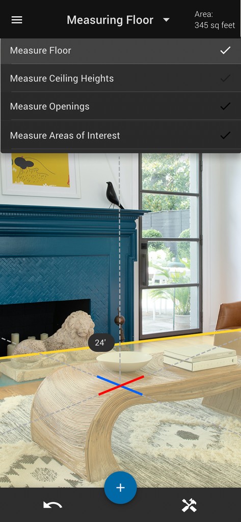
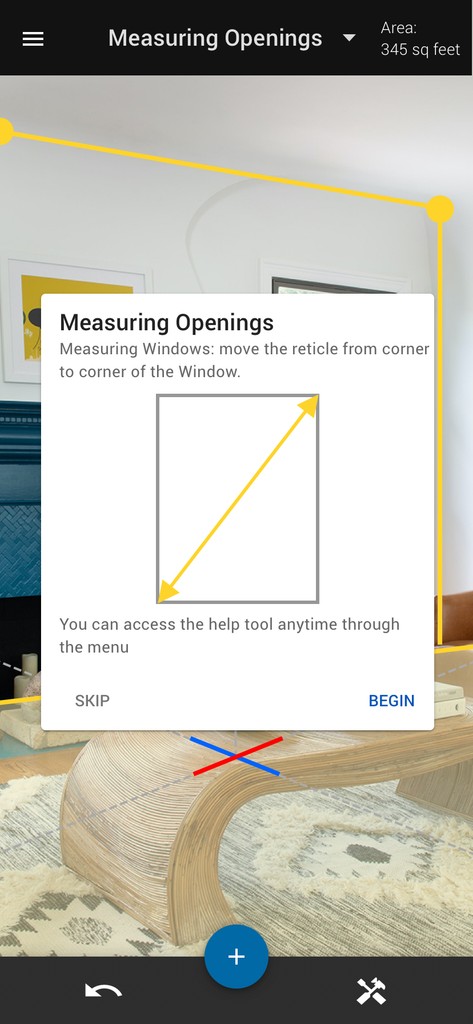
PDK, a mobile access control app, faced a significant challenge: its interface was overly complex for basic users, leading to frustration and reduced adoption. The app's primary function—allowing users to gain access to buildings through Bluetooth readers and/or in-app door unlock buttons—was being overshadowed by unnecessary features and confusing navigation.
The Solution
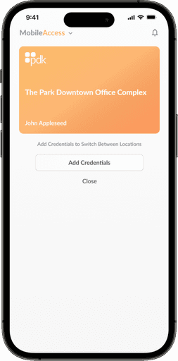
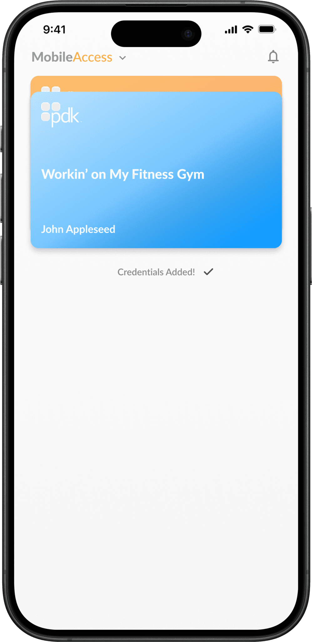
To address this issue, our team conducted extensive user research, including surveys and usability testing. We identified that most users primarily needed quick access to door controls and a clear view of their access permissions. With these insights, we streamlined the app's interface, creating a minimalist home screen that prominently displayed unlock buttons for nearby doors. With a companion apple watch app that allowed users to use the same behaviors they were used to on their phones. We also simplified the navigation, reducing the number of taps required to perform common actions.
The Results
The redesign yielded impressive results. User satisfaction scores increased by 40%, while the time taken to unlock doors decreased by 60%. App usage frequency rose by 25%, indicating that users found the new interface more intuitive and helpful. Importantly, customer support tickets related to app usability dropped by 70%, demonstrating that the redesign successfully addressed the core issue of complexity. The PDK app redesign not only improved user experience but also enhanced the overall efficiency of the access control system.
I know you’re only here for the copy. It’s fine. I get it. I’ve been a professional writer for years and I’m quite good at it. You probably don’t care about my hobbies or what books I like or the time I got a Wordle in one. I know you’re only here for the copy. It’s fine.
Tools
Figma, User Voice, Maze